Dashboard UI
About the project
Problem
Our current System experience for users is severely lacking in organization, cohesion, and user-friendliness. The system is segmented and disjointed, with information and tools scattered across multiple disparate platforms and interfaces. Users struggle to navigate the convoluted system, often finding it difficult to locate the specific resources, data, or functionality they need. This fragmented and haphazard design creates significant friction and frustration, hampering productivity and making it challenging for users to effectively manage and track their projects.
Beyond the poor user experience, the lack of centralization and visibility also poses major challenges for management and leadership roles. With data and information siloed across different systems, there is a severe lack of transparency into project status, progress, and performance metrics. Leaders have limited visibility into the overall project pipeline, making it difficult to gain a comprehensive understanding of the organization's initiatives and identify areas that require attention or intervention. This lack of visibility inhibits effective decision-making and strategic planning, as leaders are unable to clearly see the bigger picture and make informed choices to drive successful project delivery.
Our Project Team
8 Developers
1 Visual Designer (myself)
1 Project Manager
1 Product Owner
2 UAT Members
Role & Deliverables
User Experience Design
User Interface Design
User Research & Studies
WCAG Compliance Audit & Enhancements
Design System Creation
Design Workshop Lead
Wireframes & Prototypes
User Personas
Objective
Addressing the critical issues within the System should be a top priority for any organization seeking to optimize its project management capabilities and drive greater productivity and success. Consolidating this system into a cohesive, user-centric platform that provides seamless, centralized access to all the necessary tools, resources, and information required by project teams is essential. This streamlined, integrated approach vastly improves the end-user experience, eliminating the frustration and inefficiencies that arise from having to navigate disparate systems and sources to access the data and functionalities they need. Simultaneously, implementing robust reporting and advanced analytics capabilities within the Project Delivery System empowers organizational leadership with the real-time visibility and deep insights required to oversee projects strategically. This allows them to make more informed, data-driven decisions about resource allocation, risk mitigation, and portfolio alignment with broader business goals and objectives. Investing in a comprehensive, well-integrated Project Delivery System is a critical step towards driving greater productivity, agility, and long-term success for the entire organization.
The ultimate objective is to create a seamless, user-friendly project management experience that unifies all available content and data, provides shared visibility and transparency, and offers an overarching view of project information - from high-level portfolio metrics to granular details. This holistic approach enables more effective company-wide project management, improved resource planning and team collaboration, and a comprehensive record of past projects that can be leveraged for competitive and strategic evaluation.
Research
User Analytics
User Studies
Surveys
User Interviews
Competitor Analysis
User Journey Map
Accomplishments
Improved User engagement and utilization of project tracking and management
Increase in project status accuracy (records of users “completing” projects)
Increase in Management/Leadership utilization in first year
Improved Employee User Satisfaction of project management process
____________
Learn about my dashboard certificate.
Competitor Analysis
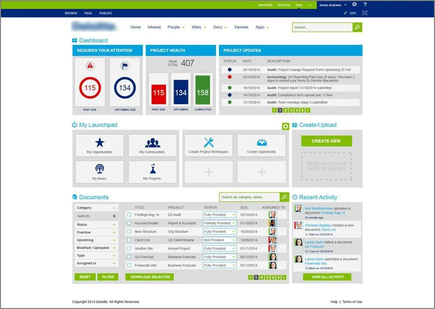
In conducting a UX audit for a digital consultancy project dashboard, we begin by examining the current state of the website and identifying potential areas of improvement. The digital consultancy project dashboard serves as the central hub for clients to track the progress of their projects, communicate with the team, and access relevant resources and documentation. To ensure that our client's dashboard stands out in the competitive landscape, we must understand the user experiences offered by key competitors.
Competitor #1
Competitor #1’s project dashboard presents a clean and professional aesthetic, with a strong emphasis on data visualization and ease of navigation. The dashboard is well-structured, with clear categorization of projects and tasks, allowing clients to quickly grasp the status of their engagements. However, upon closer examination, we find that the user interface (UI) can be somewhat overwhelming due to the density of information presented on a single page. While the information is well-organized, it may be challenging for users to find specific details without scrolling or filtering extensively. Additionally, the dashboard could benefit from more interactive elements and personalization options to enhance the user experience.
Competitor #2
Competitor #2's approach to their project dashboard is marked by a focus on collaboration and transparency. The platform encourages client engagement through features such as real-time updates, commenting, and file sharing. The overall layout is intuitive, with a simple navigation bar and a customizable homepage that allows users to prioritize the information they want to see first. However, the design appears to be more function-driven than user-centric. Some users may find the interface outdated and less visually appealing compared to other modern dashboard solutions. Moreover, the platform could offer more detailed analytics and reporting capabilities to provide clients with deeper insights into their projects' performance.
Competitor #3
Competitor #3's project dashboard offers a sleek and modern UI that is easy on the eyes and a pleasure to navigate. The dashboard provides a high-level overview of projects with the option to drill down into specifics. The use of color-coding and visual indicators effectively communicates project health and urgency. A notable feature is the integration of artificial intelligence (AI) that anticipates user needs and suggests next steps or resources. Yet, the platform might be too reliant on its AI capabilities, potentially leaving some users feeling less in control of their experience. Furthermore, the dashboard could be more flexible in terms of customization, offering users the ability to tailor the layout and information displayed to align with their unique workflows and preferences.
Analysis Summary
Comparatively, our client's digital consultancy project dashboard boasts a balance between visual appeal and functionality. The clean design and logical navigation structure are already aligned with best practices. However, by incorporating the strengths of competitors like Competitor #1's data visualization, Competitor #2's collaborative features, and Competitor #3's AI-driven insights, we can elevate the user experience even further. To stand out, we recommend enhancing personalization options, adding more interactive elements to engage users, and improving the analytics and reporting features. Additionally, we should focus on simplifying the information architecture to reduce cognitive load and ensure that the most critical information is accessible at a glance.
In summary, while each competitor offers valuable insights and functionalities in their respective project dashboards, there is room for our client's platform to differentiate itself by focusing on a more user-centric approach. By addressing the identified shortcomings and incorporating the best practices observed, our client's digital consultancy project dashboard can become the go-to choice for users seeking a seamless, informative, and engaging experience that meets their evolving needs and exceeds their expectations.
User Studies
User Survey
The survey for our global technology consultancy company's new project dashboard website has revealed a treasure trove of insights that underscore the diverse needs and expectations of our esteemed colleagues. With a response rate that can be considered robust, the survey has captured the collective voice of users who are eager to navigate the digital landscape of our company's operations with more efficiency and clarity. Let's dive into the key findings and interpretations of this feedback.
Firstly, it's apparent that the dashboard's design and usability are paramount to its success. Respondents emphasized the importance of a clean, intuitive interface that allows for quick access to critical project information. This resonates with the principle that a well-designed dashboard serves as the central nervous system of our digital workplace, providing real-time data to inform strategic decision-making. The call for a streamlined navigation system echoes the need for a user experience that minimizes cognitive load, enabling users to find what they need without getting lost in a labyrinth of dropdowns and tabs. It's clear that our colleagues crave a dashboard that's as dynamic and user-friendly as the technology solutions we deliver to our clients.
Secondly, the survey highlighted the need for customization and personalization. The one-size-fits-all approach is no longer suitable in an environment where individual roles and responsibilities vary widely. Colleagues from different departments and hierarchies have unique data requirements, and the dashboard must be flexible enough to cater to these diverse preferences. The ability to tailor the layout and information displayed to each user's role would significantly enhance productivity and satisfaction. This feature would empower users to create a workspace that complements their workflow, reducing the time spent searching for pertinent details and increasing the time dedicated to value-adding activities.
Collaboration emerged as a strong theme throughout the survey. The integration of collaborative tools such as instant messaging, file sharing, and task management within the dashboard was met with enthusiasm. It's evident that our colleagues seek a platform that not only provides project updates but also facilitates teamwork and communication. By embedding these features, we can foster a more cohesive and agile work environment, breaking down silos and enhancing collaboration across borders and time zones. The dashboard could become the digital watercooler where ideas are shared, problems are solved, and synergies are created.
Accessibility and mobile responsiveness were also highlighted as critical factors. As our company's workforce becomes increasingly mobile, the dashboard must be as accessible on a smartphone as it is on a desktop. The demand for a seamless experience across devices underscores the importance of a mobile-first design approach. This ensures that colleagues can stay informed and connected, regardless of their location or the device they are using, thereby enhancing the overall effectiveness of the tool.
When it comes to data visualization, the feedback was a mix of praise and constructive criticism. While the current dashboard's real-time data capabilities were appreciated, the way this data is presented was found to be somewhat overwhelming for some users. There's a clear opportunity to refine the visual representation of data, making it more digestible and actionable. Interactive elements such as charts and graphs that allow users to drill down into specific metrics would be a welcome addition, turning data into insights at a glance.
Lastly, the survey results pointed to the importance of performance and reliability. A dashboard that is slow to load or frequently experiences downtime can be more of a hindrance than a help. Addressing these concerns will be crucial in ensuring that the new platform not only meets but exceeds user expectations. After all, a dashboard that is unreliable or difficult to use can lead to frustration and decreased adoption rates.
In summary, the survey analysis has provided a comprehensive roadmap for enhancing our project dashboard website. By focusing on usability, customization, collaboration, accessibility, and data visualization, we can create a tool that truly empowers our colleagues to manage projects with ease and confidence. These insights will be instrumental in shaping the next phase of the dashboard's development, ensuring that it becomes a cornerstone of our digital transformation and a testament to our commitment to continuous improvement. Thank you to all who participated in the survey; your input is invaluable in helping us build a dashboard that truly reflects the innovative spirit of our company.
User TreeJack Study
To ensure that the dashboard's information architecture is user-friendly and intuitive, we conducted a thorough User TreeJack study. This involved creating a hierarchical tree structure of the website's content and tasks and asking participants to find specific information or complete tasks based on the labels provided. The study helped us identify any confusion or misconceptions in the navigation and categorization of content. Based on the results, we reorganized the dashboard's structure to match users' mental models more closely, thereby reducing the time it takes for them to locate information and perform actions. The final design presents a logical and consistent navigation system that is easy to understand and navigate, enhancing the overall usability and findability of the website.
Heat Map Study
A heat map study was conducted to analyze user engagement and interaction patterns with the dashboard. By tracking where users click, hover, and scroll, we gained insights into which areas of the website are most frequently used and which ones might be overlooked. This data was instrumental in refining the layout and prioritizing content placement. For instance, we found that the project status overview section was the most popular and thus made it more prominent and accessible from any page. Additionally, we discovered that some less-important features were receiving unnecessary attention, allowing us to streamline the interface and reduce clutter. The heat map study ensures that the dashboard is not only visually appealing but also user-centered, with the most critical information and features placed front and center.
The Solution
Design UI System
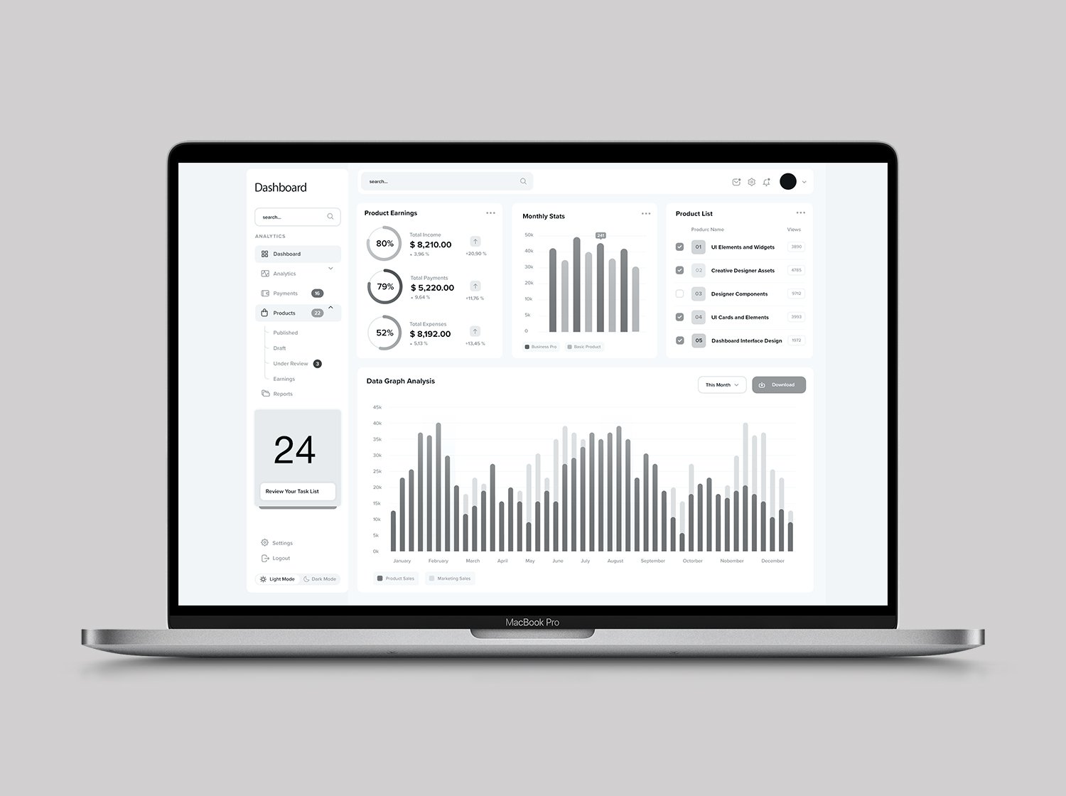
The new UI system for the project dashboard is designed to be intuitive and user-friendly, with a clean and modern aesthetic that aligns with the company's brand identity. It features a consistent color palette, typography, and iconography that create a cohesive visual language throughout the platform. The design is responsive, ensuring optimal performance on various devices, and adheres to accessibility standards to cater to users with different abilities. Key components include customizable dashboard widgets, interactive charts and graphs for data visualization, and a flexible layout that can be tailored to individual user preferences. The UI system emphasizes simplicity and clarity, making it easy for users to navigate and find the information they need at a glance.
Accessibility Enhancements
To cater to a global audience with diverse abilities, the dashboard incorporates a range of accessibility enhancements. These include high contrast visuals, text resizing options, and screen reader compatibility to accommodate users with visual impairments. Keyboard navigation and customizable controls allow users with motor disabilities to interact with the platform effectively. Additionally, the website adheres to WCAG 2.1 AA standards, ensuring that content is accessible to the widest possible range of users, including those with hearing, cognitive, and mobility challenges. This commitment to inclusivity underscores the company's dedication to creating a work environment that supports all employees and stakeholders.
Wireframes
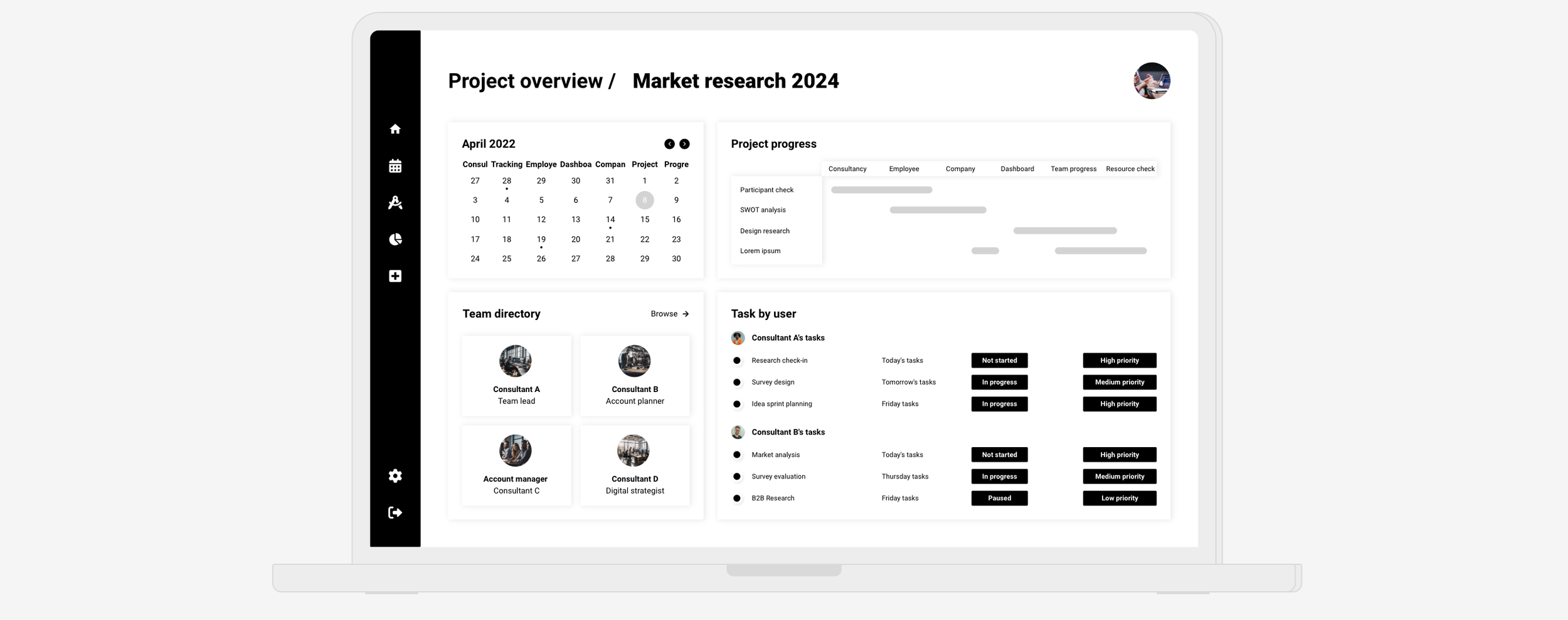
The wireframes for the new project dashboard serve as the blueprint for the website's structure and layout. They provide a visual representation of the dashboard's content and user interface elements, such as navigation menus, data charts, and interactive forms. The wireframes are designed to be scalable, allowing for the addition of new features and content in the future. They are also organized in a way that logically groups related information, facilitating a seamless user experience. For instance, the project manager's dashboard will have quick access to project statuses, timelines, and budgets, while the new colleague's view will highlight onboarding tasks and resources. People managers will see team performance metrics, and senior leadership will have a strategic overview of ongoing projects and company-wide initiatives.
Prototypes
Interactive prototypes have been developed to bring the wireframes to life and allow stakeholders to experience the new dashboard before it is fully built. These prototypes enable users to interact with the design, providing valuable feedback on usability and functionality. The prototypes are designed to mimic the final product closely, allowing users to click through the pages, interact with widgets, and input data. This iterative process helps identify any potential issues early on, ensuring the final product meets the high expectations of all user personas. The prototypes have been well-received, with users praising the intuitive navigation and the ability to quickly access relevant information.
User Journey Map
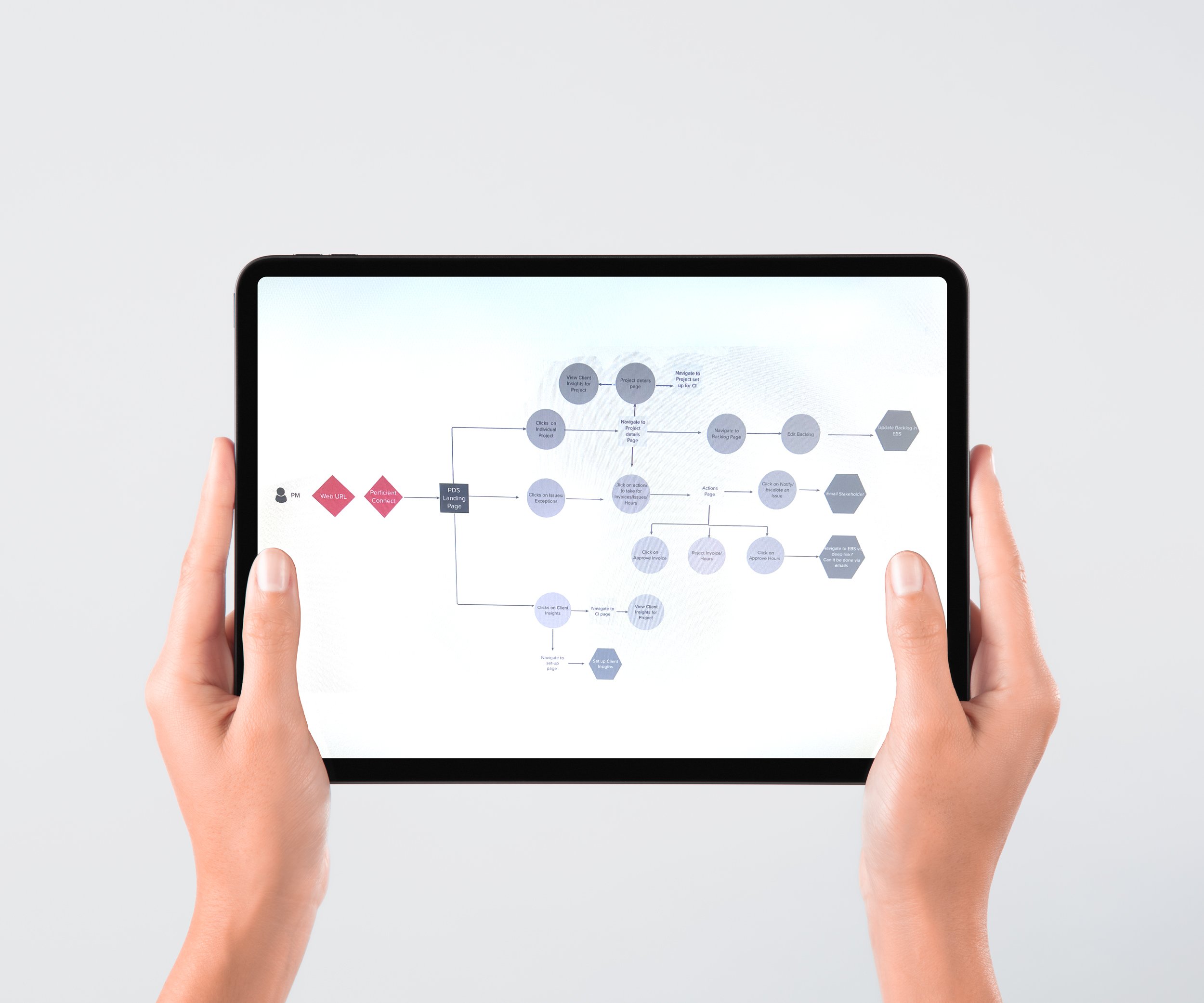
The user journey map is a critical component of the UX/UI solution, outlining the experiences and emotions of each persona as they interact with the project dashboard. It visually represents the steps each user takes to complete tasks, from logging in to accessing project data and reporting. This map has informed the design of the dashboard, ensuring that each persona's needs are addressed at every stage of their journey. For example, project managers require real-time updates and collaboration tools, while new colleagues benefit from clear onboarding processes and access to learning resources. By understanding the users' pain points and goals, the dashboard has been optimized to create a more efficient and enjoyable experience for all.
Personas
Four key personas have been developed to represent the primary users of the project dashboard: Project Managers, New Colleagues, People Managers, and Sr. Leadership.
1. Project Managers: These users are the central drivers of the dashboard. They need to manage multiple projects simultaneously, track progress, and communicate with team members efficiently. The dashboard provides them with an overview of all projects, along with detailed insights into timelines, budgets, and deliverables. It also includes collaboration tools to facilitate teamwork and a customizable dashboard to focus on their most critical tasks.
2. New Colleagues: This group includes recent hires and employees transitioning to new roles. Their dashboard focuses on onboarding tasks, team introductions, and access to training resources. The design is welcoming and informative, helping new employees feel supported and quickly become productive members of the team.
3. People Managers: These users need to monitor team performance, manage workloads, and provide feedback. The dashboard offers them a clear view of team members' progress and work allocation, allowing for better resource management and talent development.
Responsive Design
The dashboard website has been meticulously crafted using a responsive design approach to cater to the diverse needs of users accessing the platform from various devices. Whether it's a desktop computer, tablet, or smartphone, the layout dynamically adjusts to provide an optimal viewing experience. This responsive design ensures that critical project data is accessible and legible on any screen size, allowing stakeholders to stay connected and informed on-the-go. The design focuses on simplicity and clarity, presenting information in a clean, organized manner that minimizes scrolling and maximizes readability. The navigation menu is collapsible and adapts to different screen sizes, making it easy for users to find what they need quickly.
User Feedback Integration
User feedback is a cornerstone of our continuous improvement process. We have integrated a robust feedback mechanism that allows users to report issues, suggest improvements, and share their overall experience with the dashboard. This system not only collects quantitative data such as usability scores but also qualitative insights through open-ended comments. The feedback is regularly reviewed by the design and development team, who then prioritize updates and enhancements based on user needs and preferences. This iterative approach guarantees that the dashboard evolves alongside the company's growing requirements and the changing landscape of technology consultancy.
Research
Define
My Process
Design
Deploy
Measure


